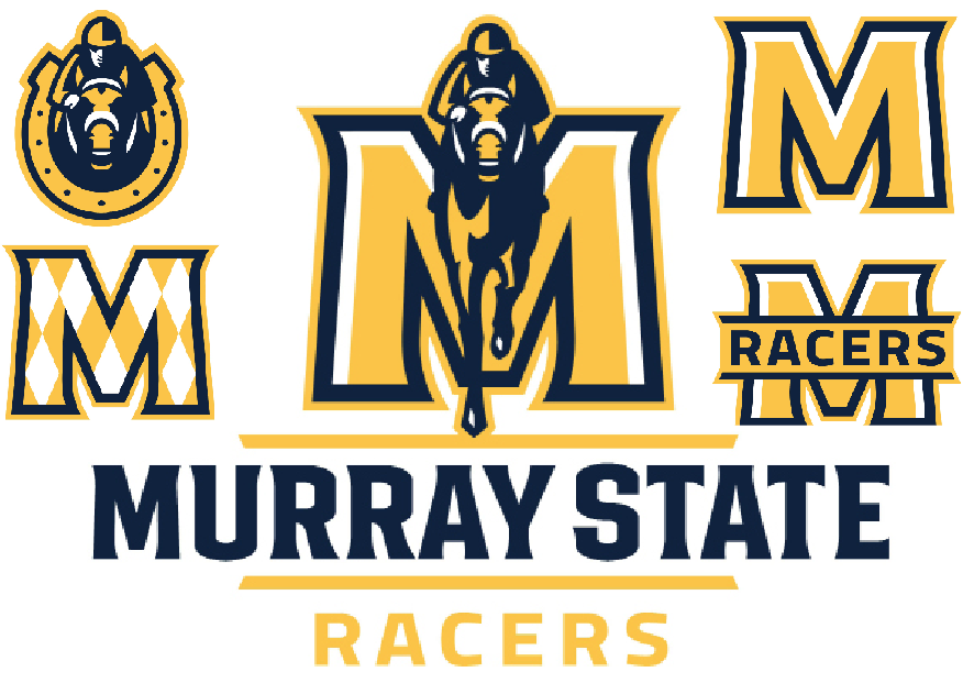
 Over the summer, the University released new athletic logos in hopes of updating the athletic department’s identity and branding initiatives. The primary logo is similar to its predecessor, with horse and jockey racing in front of a gold “M” and reads Murray State Racers underneath.
“We didn’t want to completely redo the logo, we just wanted to update it a little bit,” said Dave Winder, assistant athletic director for media relations. “I’m thrilled that we kept the ‘M’ with the horse coming right at you with the jockey. I think that’s been an iconic thing that people know us for.”
The secondary logos, including but not limited to the jockey in a horseshoe, the “M” with Racers in front, and the “M” with the same argyle that is featured on the new basketball court, will all be used throughout the athletic department to promote brand identity in various ways. The new logos are also available in both full color and one-color logos in order to optimize their use and provide more options than the old logo.
In addition to the new basketball floor, the volleyball court in Racer Arena has also been redone with the new textmarks. The new logo and checkerboard pattern will also be featured on the football helmets this year.
As brand identify became a focus of the athletic department this summer, the baseball team also saw a change. No longer known as the ’Breds, the team joins its counterparts in the athletic department as the Racers.
“I think our student-athletes are very excited about it,” Winder said. “I’ve been excited to see the new soccer uniforms coming out, and I haven’t seen the new volleyball uniforms yet, but I know everybody’s excited to have the new logos on their stuff. There’s a lot of excitement about the start of the school year, and then you add in a set of new logos and I think that really makes everybody excited.
“I just think it was time. I think the other one had been at least 12 to 15 years old, and that other one served us for a long, long time.”
The original “Racer M” logo was designed and donated to the University by Richard McClintock and introduced in 1998. McClintock, a 1966 graduate of the University, retired from AT&T as a graphic production manager. McClintock’s original work will live on through the updated primary mark.
The introduction of secondary marks and unique typography will allow the Racers to capitalize on their popularity and allow the athletic brand to grow.
“We’re going to have just a better overall brand than we’ve ever had,” Winder said. “When you take a look at the athletic wordmarks, it’s all going to look the same. That’s across the board, in all of our sports. The text mark is all going to look the same.”
The new logos and marks were designed by Joe Bosack and Co., in collaboration with Athletic Director Allen Ward, Vice President for Institutional Advancement Jim Carter and Assistant Vice President for Communications Catherine Sivills.
Joe Bosack and Co. is a nationally recognized firm that has created sports logos for high profile clients such as the Atlantic Coast Conference and the Southeastern Conference.
“I know it was a long process, but all the people that worked on it are to be commended for it; I think they did a great job,” Winder said.
The Racers designated Bosack responsible for the expansion of the entire brand through the development of other identity elements including the secondary logos, unifying word marks and uniform numbers that all connect with the primary logo.
The University also collaborated with Licensing Resource Group (LRG) on this project. Since their partnership, which began in 2002, royalties on Murray State licensed merchandise has increased from less that $30,000 per year to more than $100,000 per year.
“I really think we’re going to do well in the sales of the new logo, and that’s very important for the University as well,” Winder said.
Paul Mills, a university brand representative for LRG, noted that the new marks respect the tremendous amount of brand equity built by the outgoing logo. He also stated that the new logo will be easier to apply to many apparel items in addition to bringing the secondary marks that increase retail offerings for fans.
“I think it affects all of us. Whether you work here or you go to school here, we’re all Murray State Racers,” Winder said. “I’m really happy with it, I think we rolled it out at a great time in the summer and I’m just like anybody else, I’m excited to get some new merchandise with the logos on it.”
The University Store has been stocking apparel and other merchandise with the new logo since July 1.
Story by Mallory Tucker, Sports Editor